Make: A Closer Look
Make just debuted at the Small Press Expo, to a warm reception. I received a lot of compliments on the book’s design.
I wanted to offer a closer look at Make’s construction and share some self-publishing tips. I really dorked out on all the production details. Read on, if you’re into that sort of thing. Or you might want to skim and look at the pictures.
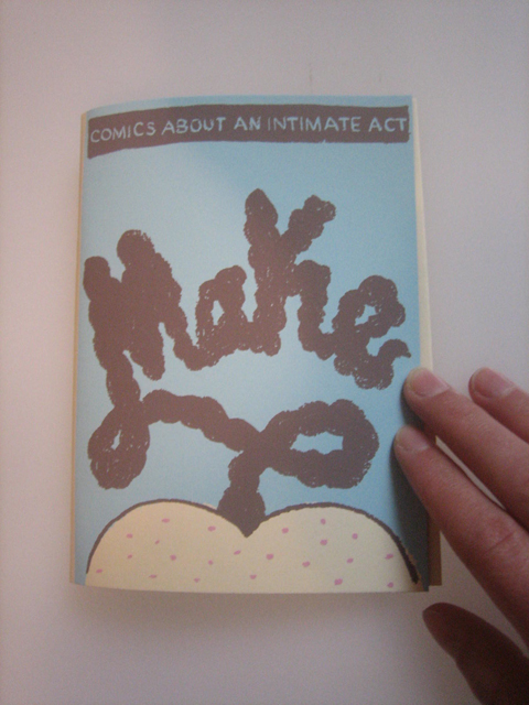
Make‘s cover, brilliantly designed by José-Luis Olivares, is a 3-color screenprint (blue, brown and pink – printed in that order). It was a pretty easy print job (the registration didn’t need to be tight). Especially the pink screen–the freckles just had to land on the butt. The asshole is a little right of center, though.
I was really happy that the texture of Jose’s line (originally drawn in China marker) came through in the print. The trick is printing with a high mesh count screen (230, in this case).
Rather than use cardstock for the cover, I used legal-size file folders, cut in half and trimmed down. I like the color of file folders, and I was able to find three boxes for cheap. I’m not sure I’d recommend this method, though. Even with access to CCS’s fancy industrial paper cutter, the cut was imperfect. The resulting stack of paper was not perfectly sized, so the registration was off at times. With tighter registration jobs, I recommend buying real cardstock, which is perfectly cut at the factory.
It can be difficult to find cardstock in a variety of colors larger than 8.5″ x 11″. The best place to go is French Paper. They have a great variety of paper sized at 12.5″ x 19″. Their paper is pricey, but the quality is high. Contact them and request a swatch book to insure you order the right color, texture and weight.
Paperworks is also a good source for legal- and tabloid-size cardstock. However, it can be tricky to judge the color, texture and weight based on their website.
Now, let’s open her up!
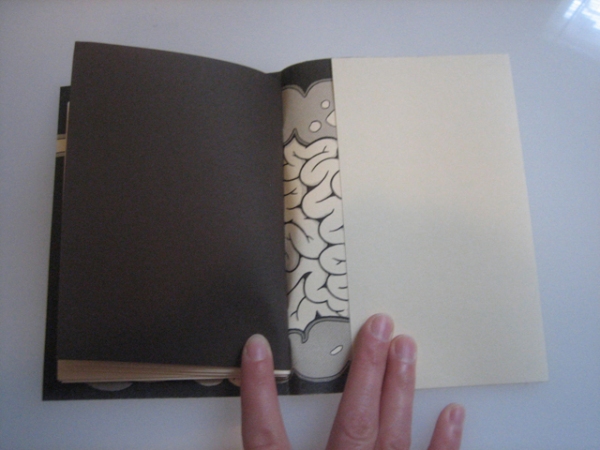
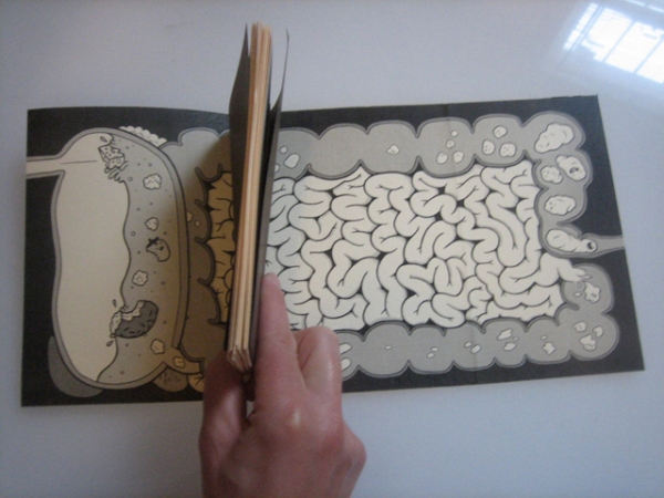
On the reserve side of the screenprint is the amazing inner cover by Maris Wicks. This is a photocopy–screenprinting this sort of detail would be extremely difficult, if not outright impossible. Choose your battles, my friend.
Maris used halftones here. To avoid moiré patterns, print images like this at size. To be honest, I think I did re-size this a little. If there is a slight moiré, it wasn’t very noticeable.
A heavy layer of toner is on this cardstock, and it doesn’t adhere well. After printing the inner cover, I spayed each one with workable fixative. I think this helped preserve the print. It’s not a prefect fix–toner will come off if you rub it aggressively.
You’ll notice that the inner cover is a foldout, with the book nestled inside. The left hand (verso) cover is 4.5″ wide; the right hand (recto) cover 8.5″ wide. With a one-sided French fold, the covers are symmetrical when the book is folded and closed.
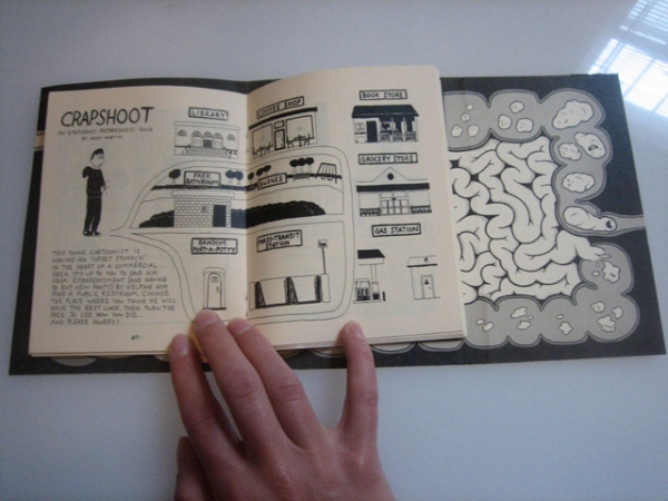
Here’s the inner spread, by the remarkable Jason Martin. Jason’s piece has a 2-page spread, so I placed it in the middle of the book and built around it. It was a bit of a challenge, but I think the book is well-balanced. Joe Lambert’s comic has some great page-turns. I was able to keep those.
As an editor, I consider a story’s content and visual style when placing it in the book. You don’t want one portion of the book to be too heavy with auto-bio, for example. Regarding style, I just put pages next to one another and decide what looks good.
You might have noticed this book is pretty thick: 80 pages, to be exact. I was able to bind it with a standard longarm stapler, but I was pushing it. Much thicker and I would need a heavy-duty saddle stapler. CCS has such a beast: the Skebbra W-115. I challenge you to find a better manual saddle stitch stapler. Such quality comes at a price (around $170).
The endpaper is made of Chocolate Brown text paper from Jam Paper. Jam Paper has quality and selection, but they are unreasonably pricey.
The interior paper is Ivory text. I rarely print on white. Ivory is so classy, and it goes with everything!
I printed the interiors at SaveMor in Brooklyn, and I’m pleased with the quality and the price. To avoid any loss of line quality, I disabled compression when outputting my InDesign file to a PDF. It made the file huge (about 300 megs) but it’s worth it. SaveMor only grumbled slightly.
Last but not least, the final page. This concept comes from the talented Melissa Mendes. Melissa gave these body templates to friends, and asked them to draw their insides. The results were very unique and personal. Melissa published them in a zine titled Guts. It’s one of my favorites.
The body template is simply printed 6-up on white cardstock, then trimmed. The pocket is made from an envelope with the flap cut off, and adhered with double-sided tape. These small, square, Kraft paper envelopes came from Jam Paper. They’re pretty expensive, so I was tempted to use library pockets instead. But I really like their look and their size.
All these little details add up in cost (and double in labor) so the book retails at $7.00. But that covers production cost (even at wholesale). And it falls within a pricing rule I’ve heard from two great cartoonists: Alec Longstreth and Jon Lewis. For every page of your comic, charge $.10 .
There you have it! Make, cover to cover. I hope I haven’t drained all the magic from it. The book is a lot prettier in person.
– Robyn Chapman


